Brandbook
These guidelines were created to inspire you in designing products, messages and graphic expressions for Greenstep that follow our strategy and values.

On Clarity
What we do
We bring clarity to the complex world of business. We care for the Greenstep Family of Colleagues and Clients, and for our Environment. Together, we can help companies optimize processes to reduce stress and save time and resources. Together, we can achieve growth that is profitable for all.
-
Values
Desire to help our clients
Will to develop ourselves and our pool of knowledge
Passion for achieving together
Honesty, appreciation and trust towards each other -
Messaging
We strive to be different in a world full of mass emails and impersonal marketing. Instead of building audiences, we want to harness a fan base; instead of being forgotten, we want to be joined in our cause of generating profitable growth through clarity. We obsess about networking and believe that it is far more profitable than superficially raising awareness. We want not to yell aimlessly, but to target. Our future clients should not only know our name, but also how we can help them.
Know our clients
Network with our clients
Have empathy for our clients
Try to relate with our clients
Help our clients -
Voice
Greenstep is a brave, optimistic authority that doesn’t lack personality. We are intelligent but not snobby; newschool but not too rebellious. Our style is progressive, aspirational, young at heart, interdisciplinary, innovative and boundary-breaking.

Logo
Primary logotype and icon
Our logotype is confident and clear. The primary logotype, the company written name, is based on the Osmose typeface. The characters have been handcrafted to create a unique logotype for Greenstep and to work in all our communications, and in various sizes. There are black and white version of the logotype available, and specific file formats for print, and screen use.
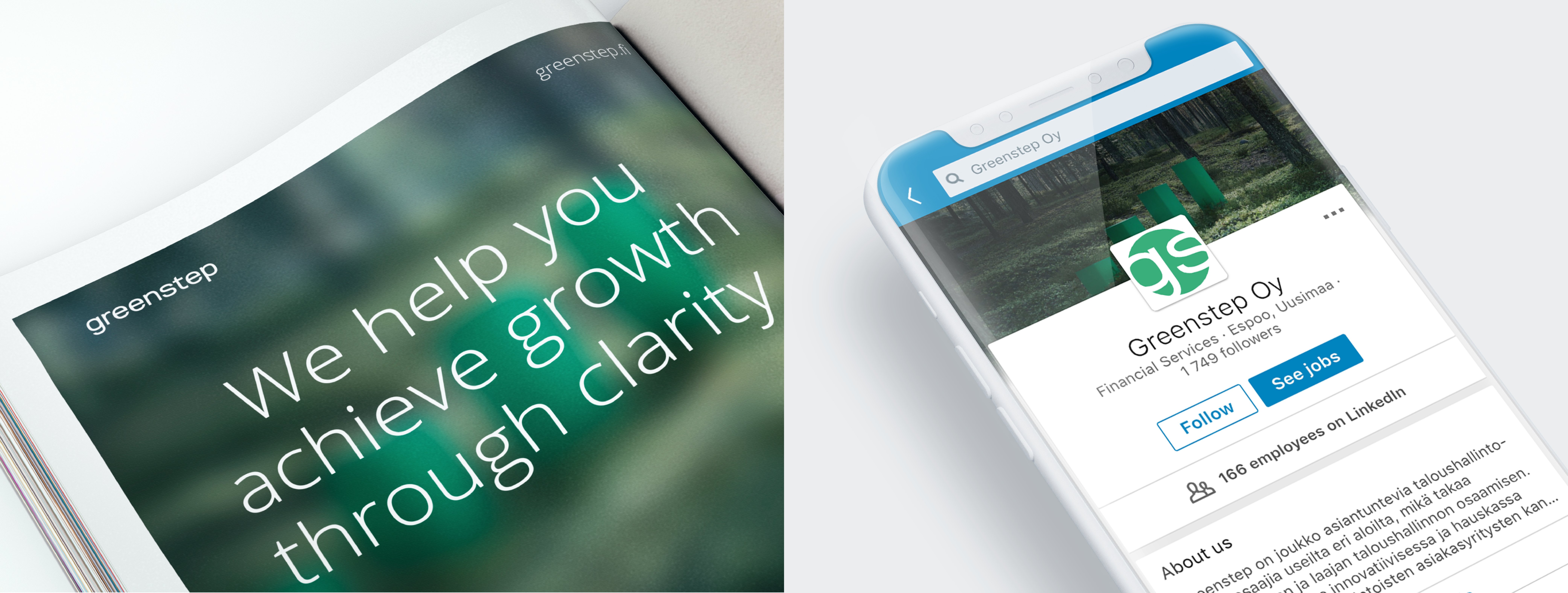
The Greenstep icon consists of the letters g and s inside a circle. The icon is designed to be used in contexts where the readability of the primary logotype suffers due to the restricted amount of space available, such as social media profile images. There are green, black, and white version of the icon available.
Logo
Primary logotype and icon usage
Use the Greenstep primary logotype in all marketing communications. The logotype can be used as either black or white. Give the logo space to breathe by leaving sufficient white space around it. Make sure that the logotype is clearly visible when placed on a colored background or on top of an image.
Avoid all alterations of the logotype. This includes rewriting or replacement of the logotype, usage of other colors than black or white, drop-shadows and other effects. Rotating, skewing, adding any effects or altering the logo in any other way is not allowed.
The Greenstep icon can be used in green, black or white. The icon can be used in contexts where the readability of the primary logotype suffers due to the restricted amount of space available, such as social media profile images.


Logo
Secondary logotype
Our secondary logotype consists of the icon and the primary logotype. The secondary logotype is to be used in third party contexts only. There are green and black combination, whole black, and whole white version of the logotype available, and specific file formats for print and screen use. The repositioning of the icon and the logotype is not allowed.

Logo
Assets download
Make sure you have the latest logo files in use when starting a new project by downloading the assets from the link below.
Colors
Brand Colors
These are the colors that make us look great. Green is our primary brand color. The additional colors are dark pine green, night sky blue, black, gray and desert gray.
-
Green
CMYK 78 0 67 0
PANTONE 3405 U / 3395 C
RGB 0 176 125
HEX #00b07d -
Pine
CMYK 96 19 75 53
PANTONE 3435 U
RGB 40 68 64
HEX #284440 -
Night
CMYK 84 73 50 50
PANTONE 539 U
RGB 40 48 64
HEX #283040 -
Black
CMYK 0 0 0 100
PANTONE Black 6 U
RGB 0 0 0
HEX #000000 -
Cool Gray
CMYK 7 4 6 19
PANTONE Cool Gray 4
RGB 183 184 185
HEX #B7B8B9 -
Light Gray
CMYK 4 3 6 7
PANTONE Cool Gray 1 U
RGB 245 245 245
HEX #F5F5F5
Typography
Brand Typography
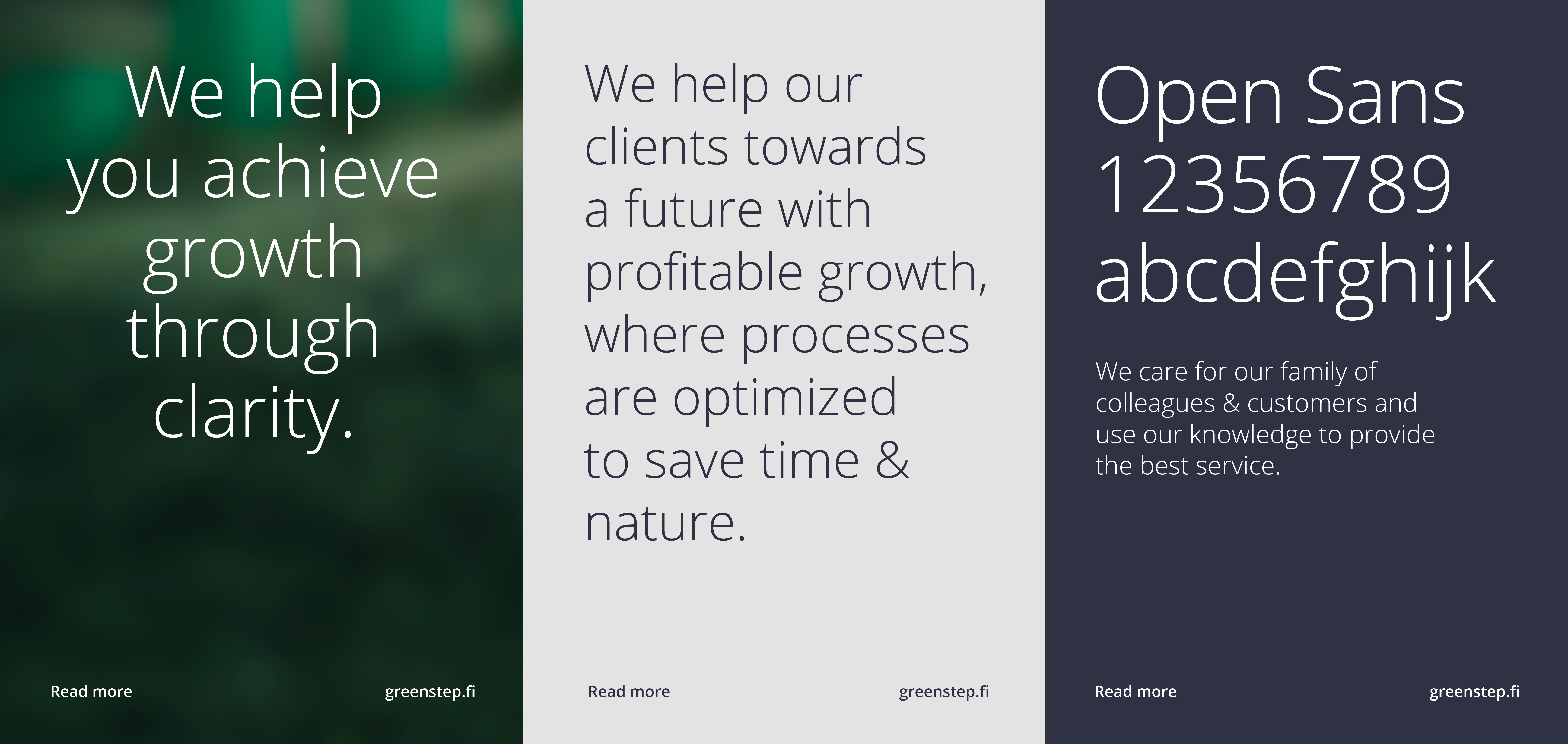
Open Sans is the main font for our graphic expressions, such as printed marketing materials, digital advertisements and our website. Open Sans is a legible, open source font, optimized for print, web, and mobile interfaces. Use Opens Sans Light for large headings and body copy. For highlighting purposes use Semibold cut. Make the design airy. Use either centered or left aligned text placement. Take care of readability as well as clear messaging. This way, the recipient will receive your message as you intended it.
Our fallback system font Arial is to be used when the usage of Open Sans is unnecessarily difficult or it is not available such as in a newsletter or email signature.

Images
Brand Images
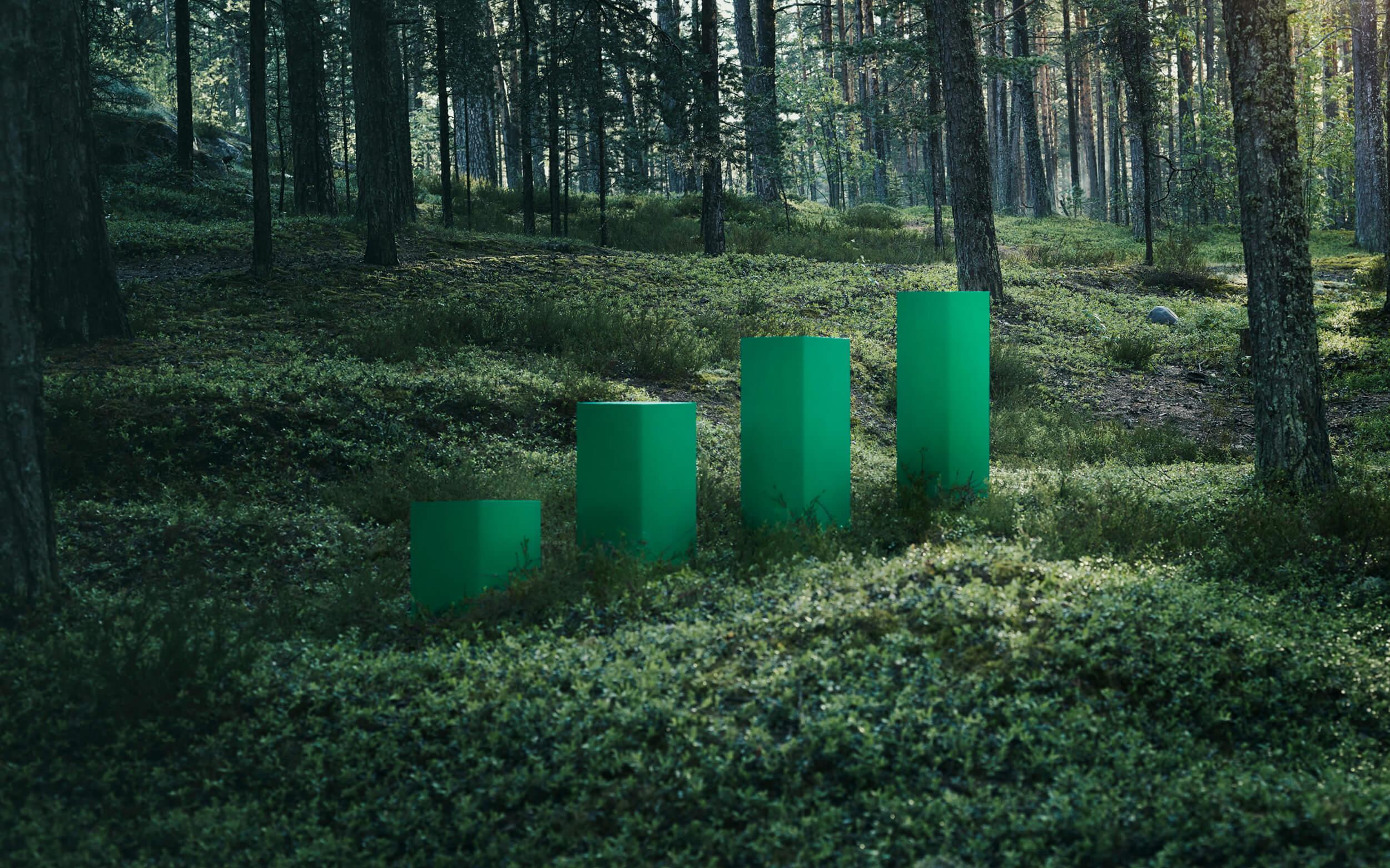
There are a series of illustrative brand images in our use for all communications purposes.
Identity
Identity in use
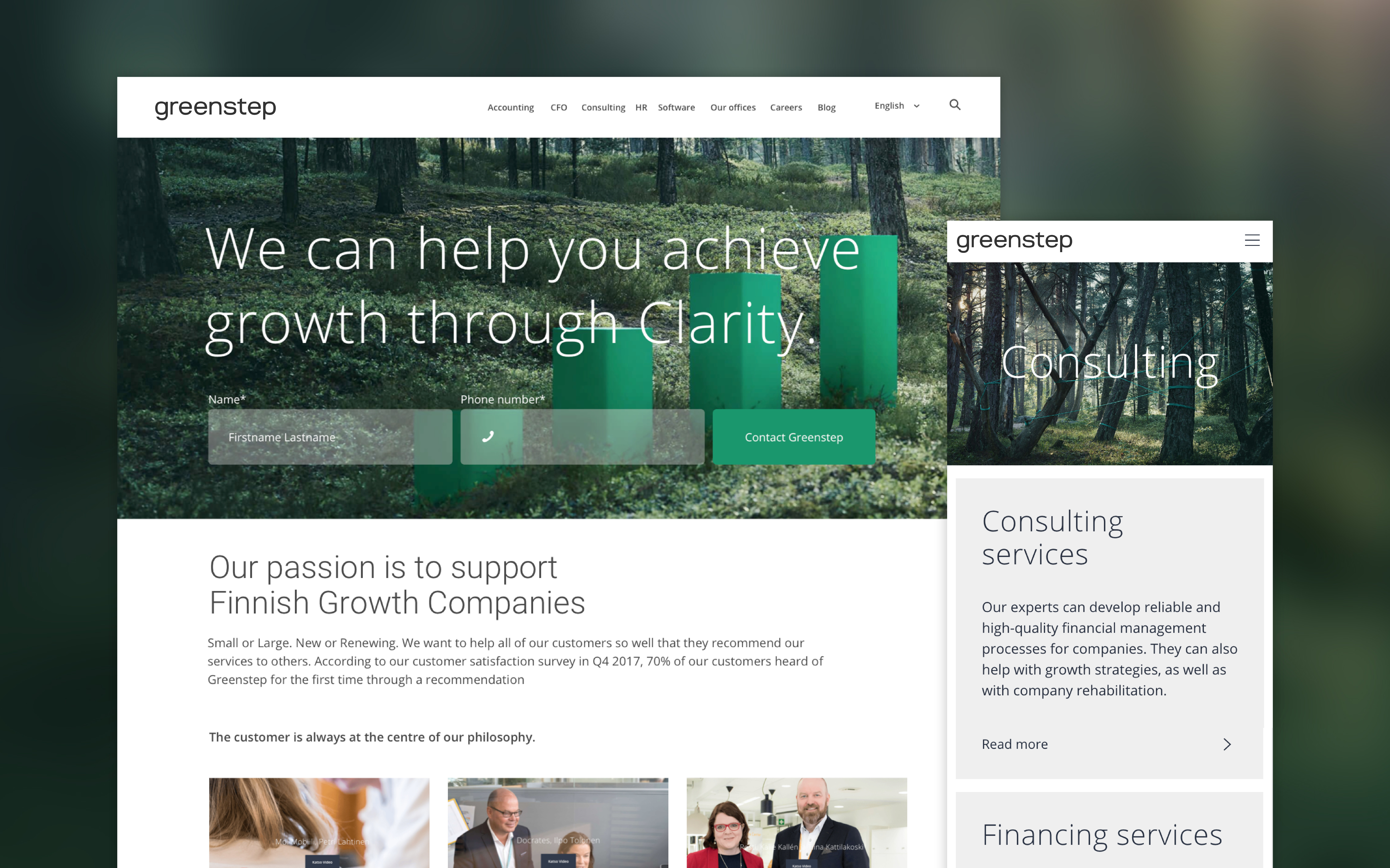
Greenstep's visual expressions are bold, straightforward and approachable. The consistent use of images and colors creates a coherent brand expression.
We believe that good design is as little design as possible. Whitespace is beautiful. Whenever a client looks at our material, they want to know more. We’ve agreed to:
Keep it simple and conversational
Present a quick read
Not to try to tell it all
Keep it positive
Keep it active
Like any digital service, Greenstep's identity is a living, responsive entity that evolves to suit all future needs and media solutions.
